About the Project
Yum Shopi streamlines the shopping and cooking experiences. It’s my master’s final project that was finished within a tight timeline.
In the process, a major flaw was found during hi-fi wireframe testing but I was able to take a step back, figure out the solution and finish up in time.
It is now featured on University of Miami Interactive Media home page.
Role and Responsibilities
It is an independent project.
Thanks to my advisors and fellow students, I got some pretty good feedback to help iterate and move along.
Initial Ideation:
I came across 5 different ideas after an initial ideation.
- Location based messaging/dating app with anonymity
- Track food in the fridge so they never expire
- 6th degree messaging/story building app
- Silly dizzy challenge/game
- Location-based discussion board/dating note
Based on the feedback and a quick marketing research, the 2nd idea seems to have more potential so I decided to move on with it.
Competitive Analysis
I want to explore more on this food tracking and receipe idea.
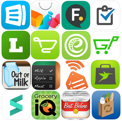
So I downloaded 16 apps that provide similar functions to make some analysis. Here are some highlights:
| Anylist: | Easy to use list with recipe implementation |
| Food.com: | Mobile app for the recipe site |
| Listonic: | Simple list with icons at the side |
| eMeals: | Weekly meal plan fo every needs with grocery list (emeals.com) |
| Out of Milk: | Website complementary app with easy barcode scan function |
| Swift Shopper: | Scan items ahead of time for quick checkout |
| ShopIt: | Simple shopping list without text input |
| Grocery IQ: | Shopping list with scan and coupon |
| My Pantry: | Simple pantry tracking app |
Some key findings:
The app should facilitating instead of guiding.
The sharing function plays an crucial role in the list creatingchecking process.
By connecting to local store, it makes user easier to locate and buy things.
Barcode scan offers a more convenient way of input items.
User/Field Research
I conducted a quick field research in the Public and Target nearby, interviewed 6 customers and 4 workers/managers.
Here are some take outs:
- 1 out of 3 people are holding a list, either in the form of paper or cellphone.
- There are basically 2 user cases among those who's holding the list, one is they are new to the place, the other is they have "orders" fro others.
- The most confusing part is the fruit/vegetable area because it changes a lot based on the availability of fruits and the season.
- Usually people don't have trouble finding things with the aisle signs at the top, but it takes time and repeated efforts.
- People usually go to shopping 1 or 2 times a week.
- They tend to stick to what they have on the list when shopping, otherwise they think it will waste their money to buy thins that's not necessary.
- The busiest time of the week is Sunday at night.
- Store: The arrangement of goods changes yearly.
- Stores under the same branch follow similar rules of arranging items in aisles.
- Season fruit and most common/handy fruit will be placed at the very front.
In a nutshell, people holding simple notes or cellphones when shopping.
Among them are 3 different kinds of shoppers:
- New to the supermarket: Experiencing repeated route when crossing out random listed items. Having a hard time find things on the list especially in the fruit/vegetable area.
- Boy/Male who take orders/lists from their girlfriend/wife and who find it hard to communicate, update the list.
- Housewives: Don’t want to leave out anything on their list. Want new recipe suggestions based on what they have.
Also, they are having a hard time keep tracking of their food in the pantry/refrigerator.
They want to consume things in the pantry in time so that nothing will go bad. They want to be reminded to consume things (fruit) other than meal on the daily basis. They also want recipe suggestions based on the current pantry.
Low Fidelity Wireframe
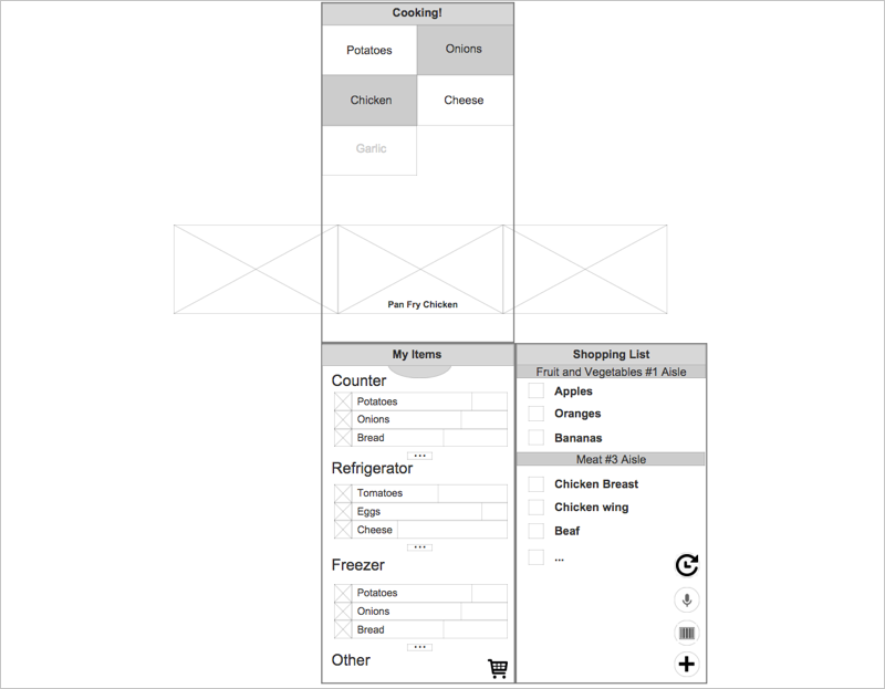
This is my initial wireframe trying to acommadate 3 different scenarios:
Cooking + List making + Shopping.
High Fidelity Wireframe
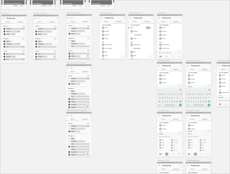
Based on some quick feedback, I quickly turned them into a higher fidelity wireframes with a complete flow, put them into InVision, loaded it on a phone and started guerrilla tesitng right away.
 InVision PROTOTYPE
- There's no clear focus on the app, all participants will take some time to figure out what it is for without my explanation.
- Elements on the interface lacks saliency, participants don't know what to do first.
- Certain function lacks of accordance such as list selecting and quantity slider.
- Some find it complicated that it requires item selection to make recipe suggestions.
- Definitely needs a better name other than “Shopping app”.
This was when I found out my interface design has a major issue:
It lacks saliency.
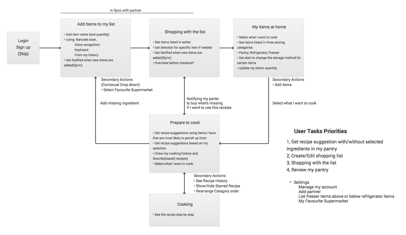
User Flow/Screen Flow
To better figure out the ideal user flow as well as a correct information hierarchy, I took a step back, did this user flow / screen flow.